Let me take you behind the scenes of one of my recent custom website design projects that I’m genuinely proud of. I recently completed a product landing page design for LIEU Vinaigrette, a local brand that makes these amazing all-natural vinaigrette sauces. This wasn’t just another WordPress site – this was a complete product promotion website built from scratch with one clear goal: turn visitors into customers.
I’m going to walk you through exactly how I approached the landing page optimization, designed the carousel, structured the content sections, and created a footer that actually drives action. Whether you’re looking to build your own ecommerce product page or just curious about the web design portfolio process, this breakdown should give you some solid insights.
Why This Project Excited Me
Before I dive into the technical stuff, let me tell you why I was so pumped about this business website design project. LIEU Vinaigrette is a 100% natural product made right here in the Philippines – no preservatives, no artificial flavors, just real fruit pulps and extracts. Four unique flavors: Passion Fruit, Mango, Spicy, and Mango Guyabano.
The challenge? They needed a conversion-focused landing page that would appeal to both retail customers and potential distributors. That meant the design had to walk a fine line – approachable enough for home cooks but professional enough for business partnerships.
Designing the Hero Section and Carousel
The first thing visitors see when they land on any product showcase website is the hero section. This is make-or-break territory. You’ve got maybe 3-5 seconds to grab attention and communicate value. No pressure, right?
Creating the Carousel Effect
For the LIEU website, I knew a static hero image wasn’t going to cut it. I needed something dynamic that would showcase all four product flavors without overwhelming the visitor. That’s where the website carousel design came in.
Here’s how I approached the hero section design:
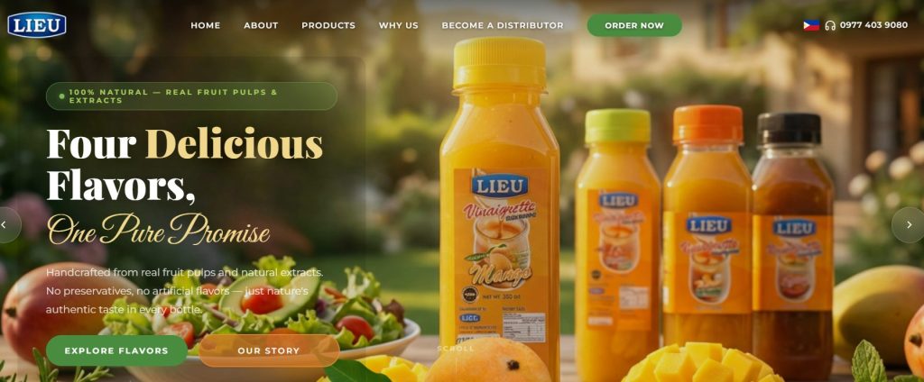
Visual Hierarchy First I started with the headline: “Four Delicious Flavors, One Pure Promise.” This had to be big, bold, and immediately communicate the brand’s value proposition. I chose a combination of serif and script fonts – the serif for “Four Delicious Flavors” to maintain professionalism, and a flowing script for “One Pure Promise” to add that artisanal, handcrafted feel.
The Green Pill Badge That “100% NATURAL — REAL FRUIT PULPS & EXTRACTS” badge at the top left wasn’t just decoration. In landing page optimization, you need to immediately address the primary concern or desire of your target audience. For health-conscious consumers (which is most people buying vinaigrette), that natural ingredients badge does heavy lifting right from the start.
Product Bottles as Heroes The carousel rotates through different product combinations, but I made sure the bottles were always front and center. Product photography is crucial in ecommerce product page design. I positioned the bottles at a slight angle with that beautiful blurred background of fresh ingredients – tomatoes, mangoes, passion fruit, herbs. This reinforces the “natural” message without saying a word.
Strategic CTA Placement Notice those two buttons: “EXPLORE FLAVORS” and “OUR STORY”? This is intentional dual-pathing. Not everyone who lands on your site is ready to buy immediately. Some want to learn more about the product (Explore Flavors), others want to connect with the brand story first (Our Story). Both buttons are equally prominent because both paths lead to conversion eventually.
The Scroll Indicator That simple “SCROLL” text at the bottom? Small detail, massive impact. It’s a user experience design element that subtly guides visitors to keep engaging with the page. Never assume people will automatically scroll – sometimes you need to tell them.
Technical Carousel Implementation
From a technical standpoint, I built this using a WordPress website design approach with custom JavaScript for the carousel functionality. I wanted smooth transitions between slides (about 5 seconds each) with fade effects rather than harsh slides. This keeps the responsive web design clean and professional.
The carousel automatically pauses when someone hovers over it – another small website layout design decision that improves user experience. If someone wants to read the text or look at a specific product, the movement doesn’t distract them.
Structuring the Content Section
After the hero carousel grabs attention, the content section needs to deliver information clearly and persuasively. This is where a lot of professional web design projects fail – they either overwhelm with too much information or don’t provide enough.
The “Four Delicious Flavors” Showcase
This section serves as both product catalog and sales pitch. Here’s how I structured it for maximum landing page optimization:
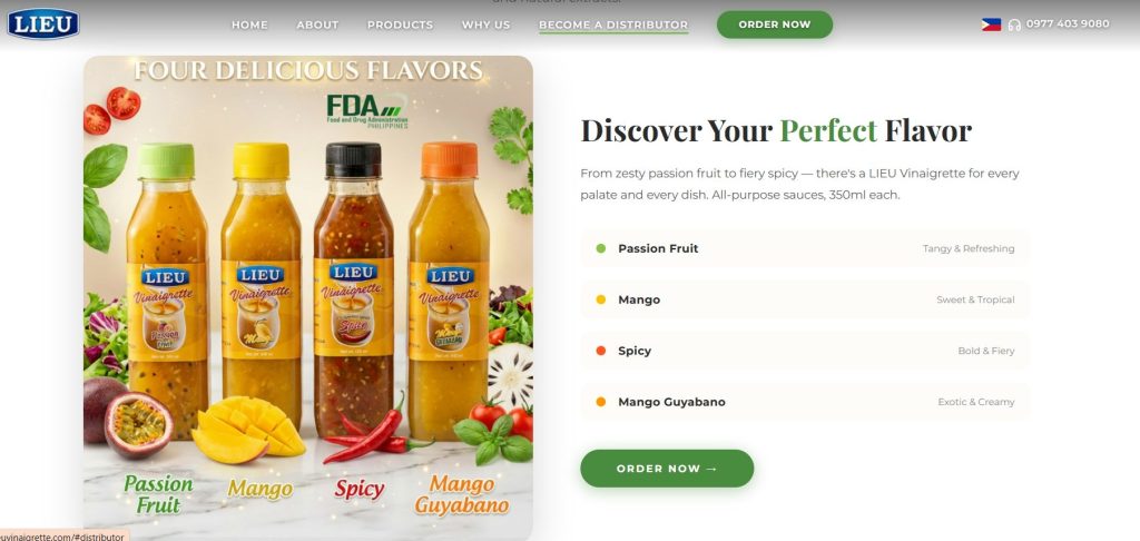
Left Side: Visual Impact The product shot shows all four bottles together with the FDA Philippines certification visible. This is critical for building trust. In the Philippines, showing that FDA certification badge is non-negotiable for food products. I made sure it was prominent but not overbearing.
The fresh ingredients at the bottom of the product shot (passion fruit, mango, chili, herbs) create a visual connection between “real fruit” and “finished product.” This is subliminal conversion-focused landing page design – showing the journey from natural ingredients to bottle.
Right Side: Discovery and Selection The “Discover Your Perfect Flavor” headline speaks directly to the visitor. Not “Our Products” or “Available Flavors” – it’s about THEM finding THEIR perfect match.
Each flavor gets:
- A color-coded bullet point (green for Passion Fruit, yellow for Mango, orange for Spicy, yellow for Mango Guyabano)
- The flavor name in bold
- A two-word descriptor (Tangy & Refreshing, Sweet & Tropical, etc.)
This format makes scanning easy. In ecommerce product page design, you need to respect people’s time. Most visitors skim first, then dive deeper if interested.
The Strategic “Order Now” Button Positioned right after the flavor descriptions, this green button matches the brand’s natural, fresh color palette. It’s not aggressive or pushy – it’s simply there when the visitor is ready.
Why I Chose This Layout
I went with a side-by-side layout (image left, content right) because it creates a natural reading flow, especially for left-to-right readers. The website layout design guides the eye from the appetizing product photo directly to the selection information and then to the call-to-action.
For mobile-responsive website versions, this stacks vertically with the product photo on top, which maintains the same psychological flow.
Crafting the Footer That Converts
Here’s where most business website design projects drop the ball. The footer gets treated as an afterthought – just dump the contact info and call it a day. But look, if someone scrolls all the way to your footer, they’re engaged. Don’t waste that opportunity.
The Pre-Footer CTA Section
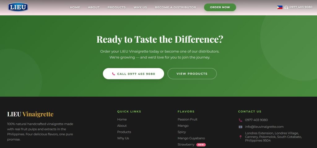
Before the actual footer, I created what I call the “decision moment” section. That green background (matching the “Order Now” button throughout the site) creates a visual break from the white content area.
“Ready to Taste the Difference?” This headline assumes the sale. It’s not “Want to try?” or “Interested?” – it’s “READY.” This is a subtle psychological trigger in conversion-focused landing page design. You’re positioning the visitor as someone who’s already decided, they just need to take action.
Dual Path CTAs (Again) Just like in the hero section, I offer two clear paths:
- “CALL 0977 403 9080” for people who want to talk to a human
- “VIEW PRODUCTS” for people who want to browse more
The phone number button is white on green (high contrast, eye-catching) while the products button is an outline style. This creates subtle hierarchy – we PREFER you call, but browsing is fine too.
The Actual Footer Design
The footer itself is dark (almost black) which creates strong contrast with the green section above it. This is intentional professional web design – the visual break makes both sections stand out more.
Left Column: Brand Reinforcement “LIEU Vinaigrette” with that golden script font on dark background looks premium. Below it, I reiterated the core value proposition in one sentence: “100% natural handcrafted vinaigrette made with real fruit pulps and extracts in the Philippines. Four delicious flavors, one pure promise.”
This is for the scanners and the scrollers who might have missed details earlier. Landing page optimization means giving people multiple chances to understand your value.
Middle Columns: Navigation and Products Standard stuff here – “QUICK LINKS” for main site navigation and “FLAVORS” listing all products. But notice I added a “NEW” badge next to Strawberry flavor. This creates curiosity and urgency. Even if someone isn’t interested in the original four flavors, that “NEW” tag might catch their attention.
Right Column: Contact Information Phone number, email, and physical address. For B2B prospects (potential distributors), having a physical address adds legitimacy. This isn’t some fly-by-night operation – there’s an actual office in Londres Village, Cannery, Polomolok.
SEO Optimization Strategies I Used
Throughout this entire product promotion website, I implemented several website design best practices for search engines:
Keyword-Rich Headings Every H1, H2, and H3 tag includes relevant keywords like “natural vinaigrette,” “handcrafted,” “real fruit,” “Filipino product,” etc.
Alt Text for Every Image Those product photos? Every single one has descriptive alt text: “LIEU Vinaigrette four flavor bottles passion fruit mango spicy guyabano” and similar variations. This helps with both accessibility and SEO.
Strategic Internal Linking The navigation, the CTAs, the footer links – all create a web of internal links that help search engines understand site structure while guiding visitors toward conversion points.
Mobile Optimization Google’s mobile-first indexing means if your site doesn’t work perfectly on phones, you’re invisible. This responsive web design looks and functions identically well on desktop, tablet, and mobile.
Fast Loading Times I optimized every image, minified CSS and JavaScript, and used lazy loading for below-the-fold content. Page speed is a ranking factor, and it also directly impacts conversion rates. Nobody waits for slow sites anymore.
What I Learned from This Project
Building this custom website design taught me a few valuable lessons:
Color Psychology Matters Green throughout the site (navigation buttons, CTAs, pre-footer section) subconsciously reinforces “natural,” “fresh,” “healthy.” This wasn’t accidental – it was strategic brand website design.
White Space is Your Friend Notice how the site isn’t cramped or cluttered? Strategic white space makes content more digestible and draws attention to what matters most.
Multiple Conversion Paths Work Not everyone converts the same way. Some people want to call, others want to click “Order Now,” some want to become distributors. Offering multiple paths increases overall conversion rate.
Product Photography is Non-Negotiable Those high-quality, professionally shot product images do more heavy lifting than any copy ever could. If you’re doing ecommerce product page design, invest in photography.
The Results
Since launching this product showcase website, LIEU Vinaigrette has seen a significant uptick in both direct orders and distributor inquiries. The “BECOME A DISTRIBUTOR” navigation item is getting strong click-through rates, and the phone number is ringing more often.
More importantly, the brand now has a professional digital presence that matches the quality of their actual products. That’s what good professional web design should do – it should be an accurate reflection of what you’re selling.
My Takeaways for Your Next Project
If you’re planning to build a product landing page design or any kind of business website design, here’s what I’d recommend:
- Start with the hero section – make it count, make it dynamic
- Use carousels strategically – they’re great for showcasing multiple products without cluttering
- Always include multiple CTAs – people convert in different ways
- Don’t neglect the footer – it’s valuable real estate
- Test on actual devices – mobile-responsive website design isn’t optional anymore
- Optimize for speed – slow sites kill conversions
- Use high-quality product photography – seriously, don’t cheap out here
Want Me to Design Your Site?
If you’re looking for someone to create a conversion-focused landing page or complete WordPress website design for your product or service, I’d love to help. I specialize in ecommerce product page design that actually drives sales, not just looks pretty.
Check out more of my web design portfolio projects on my site, or reach out directly if you want to discuss your project. I work with businesses in the Philippines and internationally, creating professional web design solutions that combine aesthetics with functionality.
The LIEU Vinaigrette project was a blast to work on, and I’m always excited to tackle new challenges in product promotion website design.
www.lieuvinaigrette.com